10 Registration confirmation emails
the 01 of September of 2022
the 01/09/2022

Confirmation emails are the first line of official communication that a business has with a client once they have registered. The main aim of these emails is to give a good introduction to the client and they should also give a clear invitation to keep up their interest in the company’s products and services.
Here are 10 of the best and worst examples of registration confirmation emails that you can learn from:
TABLE OF CONTENTS
1.- Examples of Registration confirmation emails: Pinterest
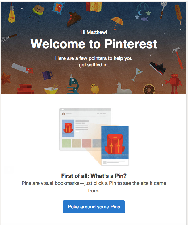
Pinterest is one of the most popular social networks in the world and works by allowing its users to post whatever images, text, etc. they find interesting onto a board, known as pinning. The welcome email from Pinterest is an interesting cover letter giving you a small taste of what the company does and it invites you to start sharing right away.
2.- EA
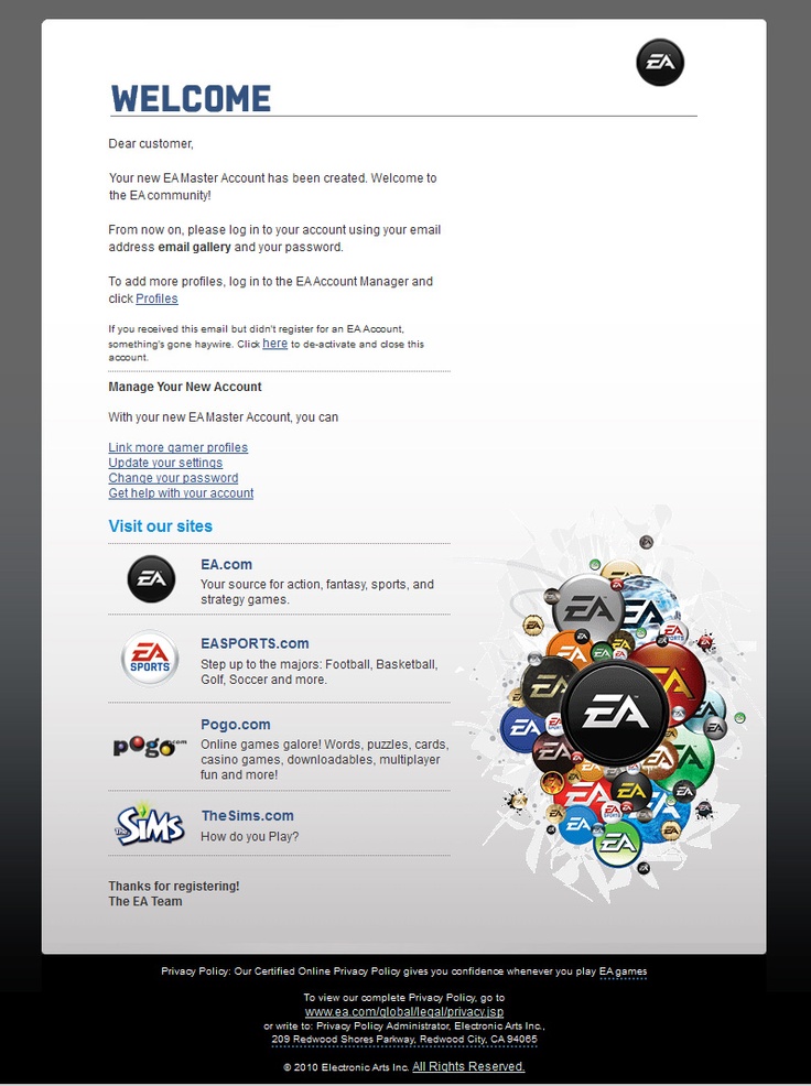
The welcome email from EA, one of the worlds leading games developers, is quite discreet. This type of email isn’t usually recommended, as there is very little hook to the message. Although, it’s safe to say that EA have the security of a strong predisposed client base for its products and so it doesn’t really need to do much more to convince them.
3.- Canva
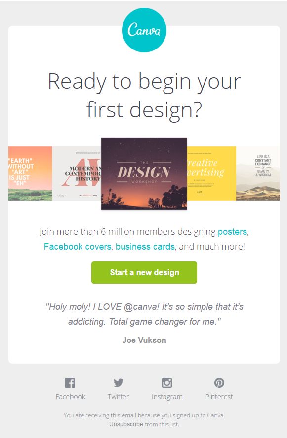
The website for creating all kinds of images such as infographics, headers for social networks, etc. follows along the same line as Pinterest by offering a brief message. This company dedicated to the image emphasizes, in his message of welcome, in the images that you can create with the platform.
4.- iCloud
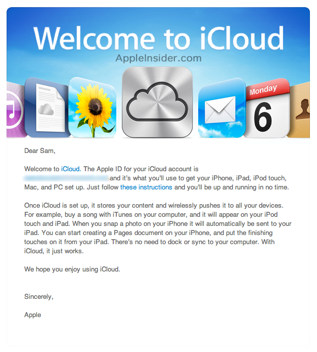
One of the better examples is for the cloud file storing service from Apple. Even though the design isn’t spectacular, iCloud gives the user enough information about their product so that they want to continue using their services after they have registered.
5.- Amazon Music
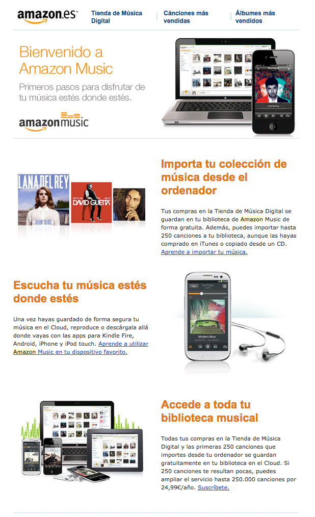
Amazon is a massive company and within it exists a special section dedicated to music. Thanks to this service it is possible to download the music you have physically bought on either vinyl or CD through a streaming platform or by sharing it on iTunes. The reason their welcome email is a success is because it uses the same colours and design as its parent brand Amazon so that it is easily identifiable to the users of this buying platform.
6.- Adobe Creative Cloud
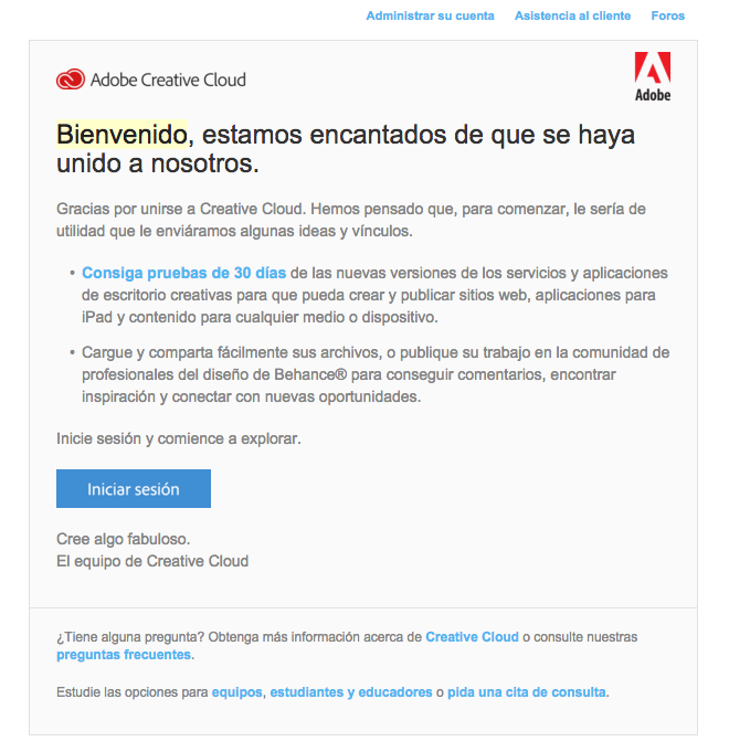
The free Adobe trail pack delivers a message that for some reason contains a striking lack of images and only a few links in order to attract the customer; it’s hardly what you would call memorable.
7.- Codecademy
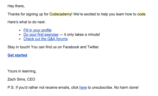
Even though the Adobe example was poor it’s still not the worst that honour goes to Codecademy, a company that teaches HTML and other computing codes. It’s strange that a website dedicated to computing would send such a poor confirmation email and a weak example in terms of showing off what can be achieved by mastering HTML.
8.- Instagram
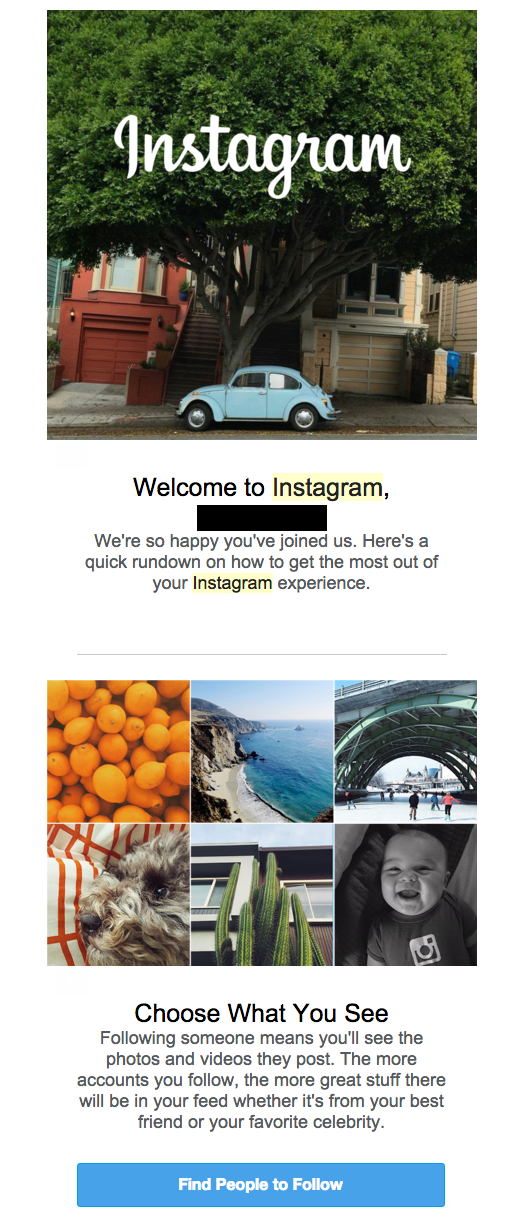
One of the better examples comes from Instagram. The photo sharing social network sends an email, much longer than the one shown, which directly encourages the users find their friends, share photos and become part of the community. It’s the perfect example of what needs to be done in order to attract clients.
9.- Alsa
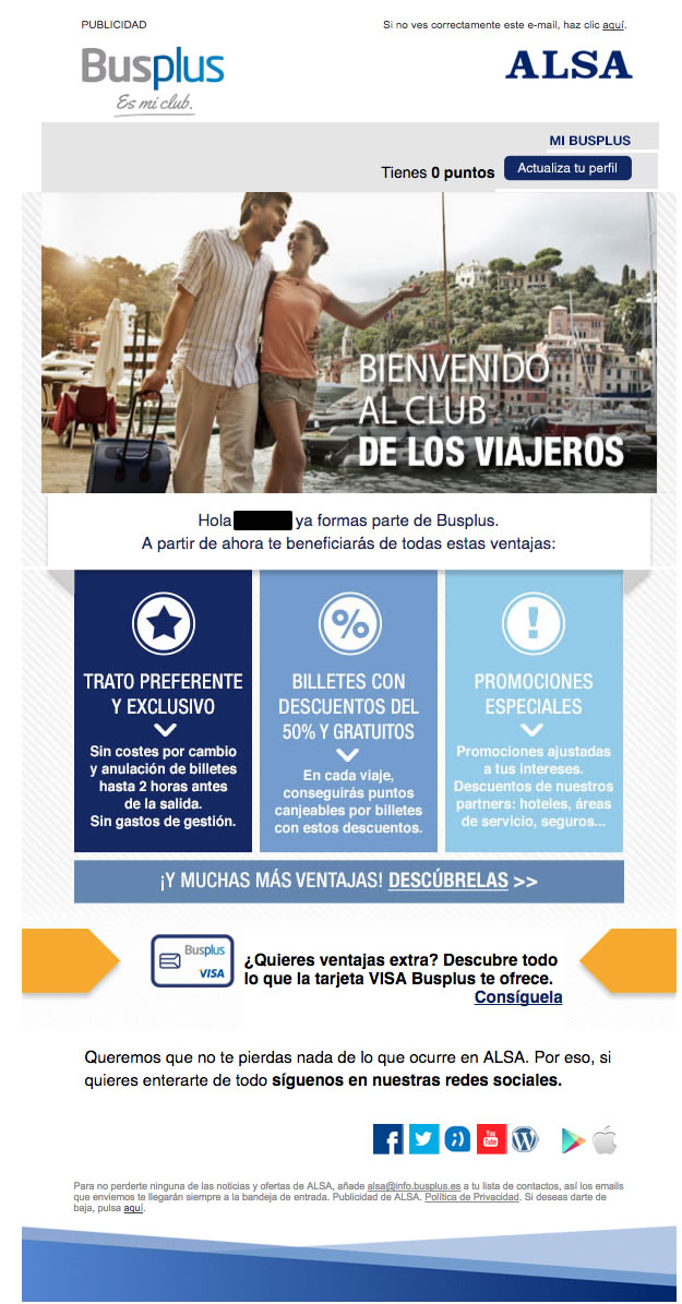
This transportation company has introduced a service called MyBusPlus, where users can get benefits from travelling, by earning points and receiving discounts. The email is good; it’s not the best but it could be a good example of something to strive towards. Its just a summary of what you can find on the website once you have completed the registration.
10.- MDirector
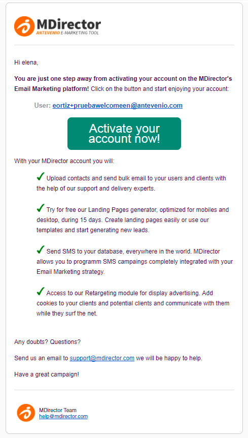
The welcome email from MDirector is an example what you can do without the need for images. It’s not always necessary to include photographs, it can also be useful to emphasise colours to make things stand out or use icons that are really important. Overall, its about guiding the user to your website and giving them a better understanding of what you offer.


 and Its Importance in Email Marketing?")