25 examples of incredible creative banners
the 17 of October of 2016
the 17/10/2016
Banners are one of the most important resources available to online advertisers. Even if you take into account what is known as banner blindness, which states that most users actually ignore information in a banner format, the truth is that there are countless examples of creative banners, which show that they continue to exert a huge influence.
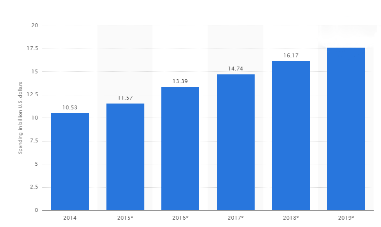
From the first banner in history launched by AT&T on Netscape in 1994 up to the current forecasts, which predict that the total investment in digital banners this year will top 17.68 billion dollars in the United States alone that still leaves the rest of the world. In those 22 years thousands of examples of banners have been created, with many of them achieving their objectives of helping the brands to increase their leads list as well as their sales revenues.
TABLE OF CONTENTS
Types of Banner
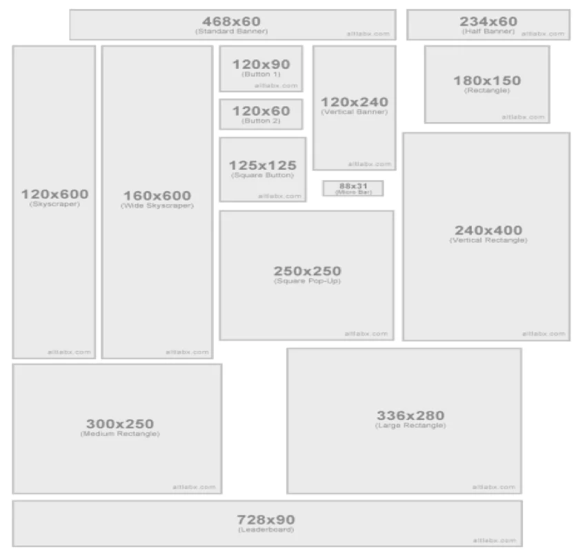
On of the main problems that needed to be resolved was the standardization of the banners. In the early years you would see banners of very different sizes. Today, thanks to organizations like the Internet Advertising Agency (IAB), the main leaders in the industry have come together to put in place a number of standards that identify the different banner formats:
- Integrated Formats:
- Mid Page Unit (MPU) / Medium rectangle 300×250px
- Mid Page Unit (MPU) / Square 300x300px.
- Mid Page Unit (MPU) / Splitscreen 300x600px
- Banner 468×60px.
- Medium banner 234×60px.
- Medium banner 234×90px.
- Leaderboard 728×90px.
- Leaderboard 900x90px (depends on the publisher)
- Skyscraper 120×600px
- Special Formats:
- Expandable Formats:
- Mid Page Unit (MPU) / Medium rectangle 300×250px
- Mid Page Unit (MPU) / Square 300x300px.
- Banner 468×60px.
- Medium banner 234×60px.
- Leaderboard 728×90px.
- Skyscraper 120×600px
- Floating Formats:
- Interstitial 800×600px.
- Layer 400×400px.
- Rising Stars:
- Billboard 900×250px.
- Filmstrip 300×600px (300×3000px).
- Portrait 300×1050px.
- Slider 950×90px (Expandable up to 950×550px).
- Sidekick 300×250px (Expandable up to 850×700px moving the editorial content to the left).
- Pushdown 970×90px (Expandable up to 970×415px).
- Expandable Formats:
4 steps for designing creative banners
Creating an effective and attractive banner that can grab the user´s attention is not easy. In the first place, you are competing against a number other factors on the webpage that are all vying for the same attention: images, logos and all kinds of content.
In addition, what makes it equally difficult with regards to banners is that they have to stand out among the thousands that are created every year. That is why it is important to follow the next 4 steps when designing creative banners:
- Define clear and fixed objectives. It makes absolutely no sense to start working on a banner if you don’t know what goal of your campaign is going to be. Do you want to publicize a product? Perhaps your goal is to sell a particular service? Does the time of year have an influence? The objectives should define the creative. If you want traffic to come through your website, take care with the call to action. If what you are looking for is notoriety, you can focus on creating a design based on the style and content of the website where the banner is shown. Having clear goals in mind will help you to create a more effective banner.
- Addressing the right audience. Understanding the user that you want to impact is essential when designing specific creatives. The best examples of creative banners always keep in mind the audience that they are targeting. Its not the same trying to grab the attention of someone who hates the sight of pop-up banners than impacting teenagers who are used to dynamic banners. The tastes and interests of different users are essential elements to consider when building the right banner.
- A clear message. You have little space available for several elements; therefore, the message has to be brief and direct. Forget fancy phrases and explanatory texts. A good banner is based on a body of very few words but it is important that they are related to the Call To Action. A convincing message that begins with the text of the banner and ends in the call to action will help increase the number of clicks of the users.
- Balanced and attractive design: Design is one of the standard elements involved in all examples of creative banners. A striking and dynamic design can make you achieve more clicks. However, it is important that the design is related to the brand and the site where you send the traffic. A good landing page that is tailored to all devices is the right end result for a successful display banner campaign. To do this, you must have all of the banner elements the right way and consistent with the design of the landing.
These are the basic steps that every creative banner should follow. However, nowadays, the current trend is actually going much further. Companies are trying to make the user´s experience even more exceptional by offering them the opportunity to participate in the banner. Traditional banners have thus been transformed into more audio-visual based elements with great designs in order to increase the possibility of interaction and in turn achieve the desired click from the user.
5 Characteristics of creative banners
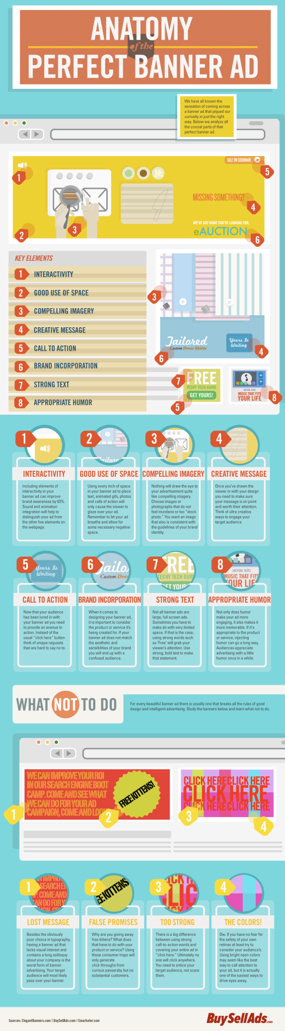
In the above Infographic, which shows the anatomy of a perfect banner, we can identify the 8 elements that are key to any banner:
- Interactivity
- Use of space
- Compendium of images
- Creative message
- Call to action
- Brand name
- Direct message
- Appropriate humour for the message.
A combination of these elements will produce some great examples of creative banners:
1.- Organizing and using the space properly
Understanding the basic elements that can influence a user´s decision makes it easier to optimize the available space. A MPU 300x250px is not the same as a Leaderboard 728x90px. Therefore, it stands to reason that the positioning of the text, images and the call to action button will logically have to vary.
As you will see later on, the best examples of creative banners take full advantage of these limitations and formats to increase the number of clicks.
2.- Simple design
The banner has to be creative but its objective must also be evident: achieving clicks or impressions. So forget about complicated animations or overloading the design with too many elements. The simpler the design, the better, in the available space it is important to communicate the essentials quickly. This is the only way to get the users attention and get them to click on the call to action.
3.- Including an effective call to action button
The call to action (CTA) is a standard element on any and all banners with the basic “Click here” button being the most commonly used. However, if you want to ensure the users click on it, you should make sure that the text is attractive and persuasive. Even a single word can help increase the traffic to your website exponentially.
4.- Adapting to the media
Does it make sense to create the same banner in one format or another? And should it go in the header of a news publisher or in an article of a digital magazine? Every banner must suit the environment that it is in, the message must be the same, and the creative elements must be consistent. Therefore, adapting the banner to the media where it is placed is one of the keys to its success.
5.- Related to the landing page
A good banner is always related to a landing page, which is where the conversion cycle ends. In order to achieve this, the content and the design should be closely connected to the landing page. It doesn’t make sense to design a banner that doesn’t take into account the webpage where the user will end up. At the very least the main elements such as logo or corporate colours should be taken into consideration.
10 Mistakes to avoid when designing banners
As you can see from the above video, when designing a banner you can commit a number of errors, which could impair its performance. The 10 most frequent mistakes in banners are:
- Using too much text.
- Confusing text or language.
- Incorporating an erroneous logo or one that is not attractive enough.
- Not using high resolution photographs
- Not presenting a professional design
- Not having a specific, clear and convincing Call to Action Button.
- A banner that has nothing in common with the website or landing page that the user is being taken to.
- Investing too much money in displaying banners. Display banners have a short shelf life, so over investing can end up damaging the whole campaign as there wont be an adequate return on your investment.
- Hiring an inexperienced designer. Designing banners requires experience. Although it may not look it, a lot of elements go into making a good banner and they must be handled in the right way.
- Not performing A/B testing. One of the great benefits of digital marketing is that you can use A/B or Multivariate testing to analyse which of your creatives work best. Therefore, it is the data and the users themselves that decide the way forward.
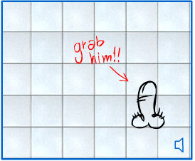
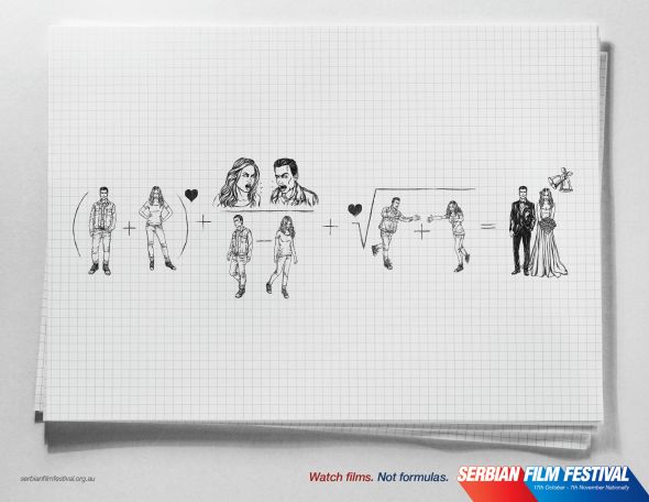
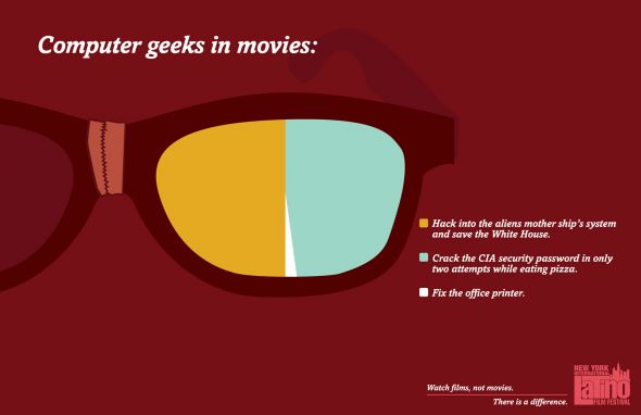
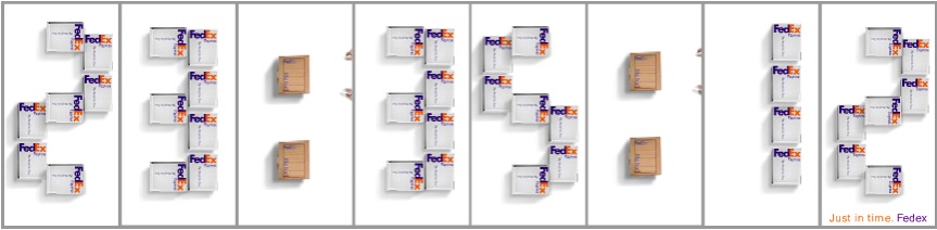
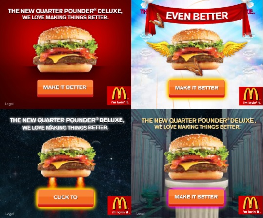
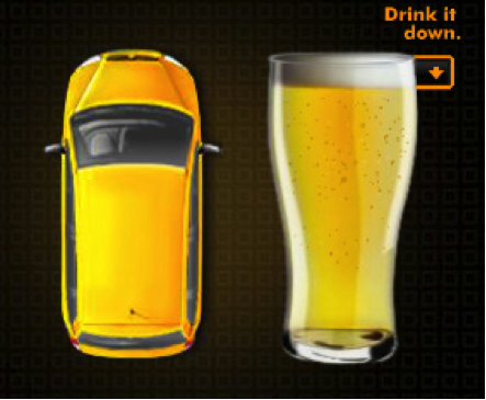
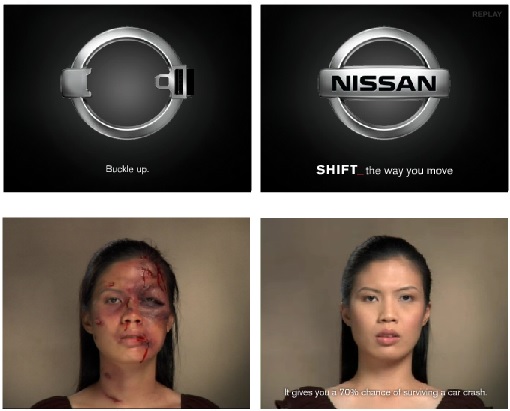
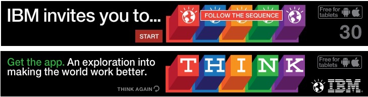
25 examples of creative banners
Once you have taken on board all of the above aspects that make a great banner, we will next take a look at 25 examples of creative banners in action.


One of the areas that brands work on the least with their banners is the possibility for retargeting that they offer. For this reason, it is necessary to design your banners keeping one eye on the need to attract users who have already visited your landing pages. In order to make these banners as effective as possible you have to have real-time data from the moment you launch a retargeting campaign.
Only a professional digital email-marketing platform like MDirector allows you to take full advantage of every aspect of your retargeting campaigns with optimized banners to capture more audience.


 and Its Importance in Email Marketing?")