3 examples of forms that will help you capture subscribers
the 18 of January of 2023
the 18/01/2023
The form is a fundamental part of recruiting subscribers in any digital marketing strategy as it is the point where the users will decide whether to sign up to what is being offered or simply leave. For this reason it is important that you work on properly segmenting the users that you want to arrive at the form.
However, it’s not always easy to guarantee when a form is going to work but there are a number of tried and tested parameters that work well for an online questionnaire:
- Extensions: The form should always be as brief as possible. However, it is important to find the right balance between obtaining the essential information needed in as few fields as possible. The average extension is between 3 and 6 fields, although there are effective forms with as little as one that ask for an email address. Additional can be obtained later with an email campaign or by telephone after the initial engagement of the first questionnaire.
- Include a clear and specific call to action. If you only use the words “send” or “submit” you will lose up to 3% of conversions. However, if you use more action orientated language such as “register”, “download” or “purchase” you can increase the possibilities of conversion by 30%.
- Offer guarantees to the users. A form must comply with all legal requirements, including information and links to the privacy policy, furthermore, it is also important to include factors that can give the user extra confidence like a seal of trust.
TABLE OF CONTENTS
3 examples of effective forms for generating leads
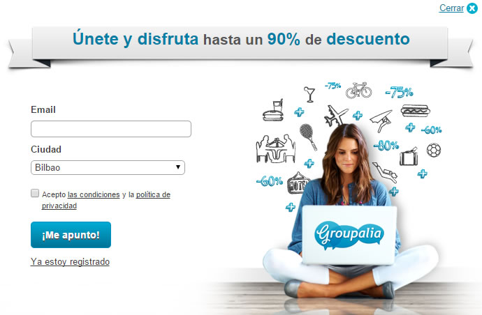
The first form from Groupalia, is a good example of the brevity that is required in an effective form when recruiting subscribers. In that it only asks for an email address and for you to choose a city from a drop-down menu.
If we look at the call to action, the blue button on the white background really stands out and matches the corporate colors as well. The text is also assertive and incites action.
In addition, we can see a good connection is formed not only in terms of colours, in which the tonal blue predominates but also, and what`s more interesting, between the title “Join and enjoy up to 90% discount” and the call to action, “I’m in!”
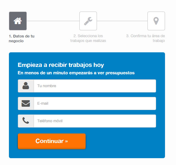
The next example is an online questionnaire from Habitissimo and demonstrates two good ideas:
- The fields include text indicating the kind of information that should be entered in each one, “Your name”, ”e-mail” and “mobile phone”. That way the user knows exactly what to do.
- Even more important is the way that an extensive form has been divided up into several parts. The “Continue >>” button tells you that the form doesn’t end there, in addition in the header of the form there is a graphic showing the user the step of the process they are at and how many steps are left to go. This is a good way of encouraging the user to continue to the end. In fact this approach is much better for attracting subscribers than just placing all of the fields in a much longer form.
With this form you not only comply with the parameters for maintaining an effective form but you also give yourself the possibilities for segmenting the users later on.
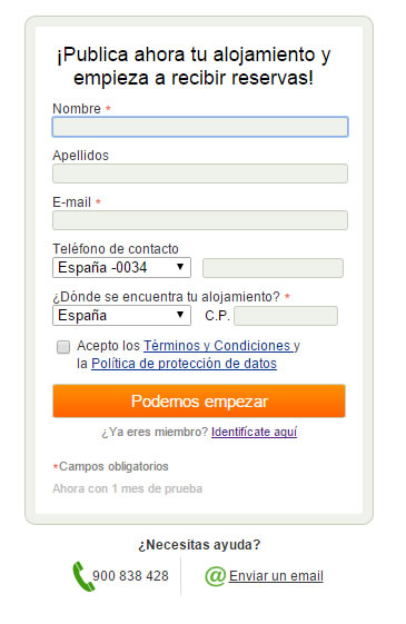
The third form that we have chosen is for hotels to sign up with the Top Rural reservation centre and it includes a few more fields than usual, although not all of them are mandatory. In fact there are only two: name and email address, these are identified as mandatory using the widely known asterisk (*) symbol. There is also an explanation of the asterisk at the bottom of the page if needed.
The elements that make this online form effective in capturing subscribers are:
- An attention grabbing headline that gives the user what they are looking for: “Publish your accommodation now and start receiving reservations”.
- A well-contrasted call to action button highlighted in orange with the text “We can start”
- Each of the fields has a title indicating what kind of information has to be included.
- Links to legal and privacy policies that have mandatory check boxes so that the user can agree to the terms and conditions.
- At the bottom of the form there are two different options in case the user needs help either by telephone or by email, each of these give a guarantee to the user and a efficient way of capturing subscribers.
These are just 3 real world examples of effective forms that we found. Do you know of any others that could inspire us?


 and Its Importance in Email Marketing?")