10 examples of perfect landing pages
the 20 of May of 2025
the 20/05/2025

Did you like this article? A landing page has one main purpose: to make sure that the user converts. Or in other words, to ensure the user passes from being a mere visitor to the site to becoming a client. We all know the theory behind this process, but its not as easy at it seems. In fact the perfect examples of landing pages that we are going to show you below have only come about after hours and hours of hard work so much in fact that the end results will have gone through numerous tests.
Therefore, regardless of which sector you are in, it is always a good idea to follow certain steps. The base of which are constancy, creativity and the following of good practices.
You will have to put a lot of effort into each of the different aspects if you want to create a landing page that may be considered perfect in future posts.
There aren’t any fixed rules that will make instantly make your landing page magnificent. In fact, each brand always adds a personal touch that gives value and is in keeping with the essence of the brand itself. Look around, see what you like and decide whether you can incorporate it or adapt it to your business.
Building and promoting landing pages that generate conversions will take time but these 10 perfect landing pages are sure to wake up your inner creator and inspire you.
TABLE OF CONTENTS
Examples of perfect landing pages
1.- Due
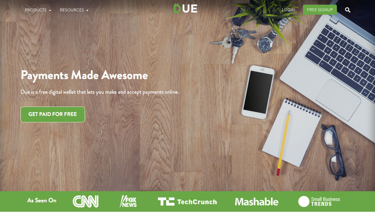
The editors at Due built their landing page with one purpose in mind: to grab the users attention and make them want to sign up to their free billing software.
For that reason they went with a short, descriptive and catchy title: ““Payments Made Awesome“. That way, not only do they describe what they do, but they also separate themselves from other businesses in the industry that use more commercial headlines and that all tend to be very similar.
It’s only in the second line that the business introduces a small message telling you about its operation and of course, the call to action with its button is also clearly visible.
2.- Patreon
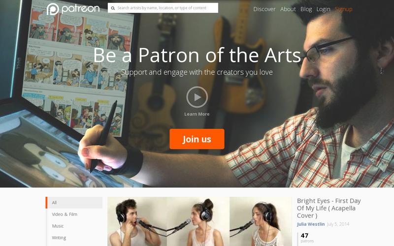
Another example of a perfect landing page is that of Patreon which utilizes both inspirational and aspirational copy. Making references to aspirations is one of the most powerful tools available no matter what the language.
Patreon connects artists and their works to their followers who can finance them through small donations and contributions.
In truth, in order to achieve this objective the brand could have opted for any number of approaches for its landing page, but through this style of copy it is able to launch a message that appeals to the visitors desire to play a crucial part in the creative process.
3.- Trulia
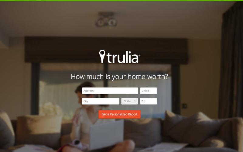
One of the best ways of tempting potential clients into converting is by posing a question on your landing page. In doing so, you actively encourage the user to respond by filling out a form which will, in turn, guarantee you their data.
Taking advantage of the user´s curiosity is a great technique for getting the information that you need. As seen in this landing page which uses 3 simple elements:
- A title with a question.
- An attractive background image.
- A simple form that ends with a relevant call to action.
4.- Simple
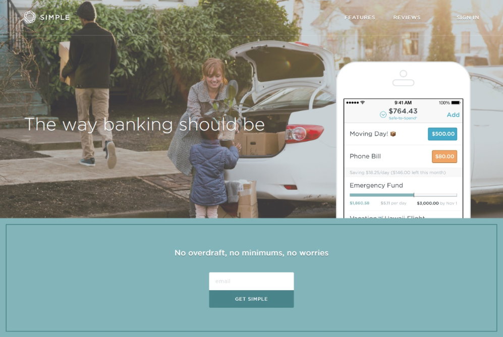
Simple is the clearest example of how to easily make use of many elements without it looking overloaded. In fact, the brand name itself gives a clue of what to expect: simple. From the overall design right down to the form.
On this landing page every little detail has been thought about which can be seen in the coordination and positioning of each element. To begin with, the image of the phone shows us how the application works and is telling us that it is “moving day” which also corresponds with the background image. It also demonstrates the importance of choosing images that help you.
Its best to avoid flashy photographs that don´t really say anything or that don´t fit in with your brand and its message.
In this respect, the brand has done well. Choosing the right image for your landing page is essential if you want to increase conversions. A person can process and identify an image in anywhere between 13 and 100 milliseconds so you must make sure that the images you use are both visually striking yet also contain all of the information that you wish to show.
Factors to consider in order to improve your landings
- All of the images that are used on the best landing pages direct the users attention to what is important and that is exactly what you should aspire to do in your own landing pages.
- As you already know, all of the images should follow in the same direction by maintaining your corporate identity. Which means that when we see an image, no matter whether it shows a product or not, everyone knows who the company is.
- Use them to convey emotions
- Show people. Photographs with people convert more.
5.- Happify
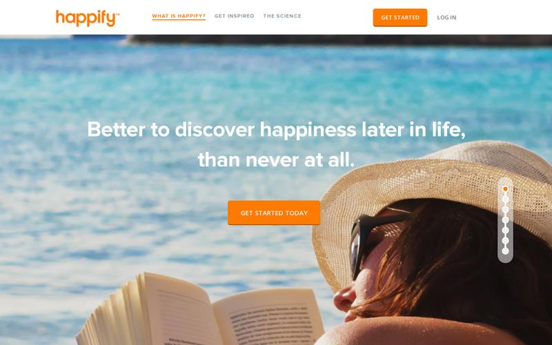
One of the main reasons why the majority of B2B content is so “Smooth” is because a lot of businesses avoid going in for emotional responses in their strategies.
Appealing to peoples’ emotions is a proven and highly efficient practice that we can see demonstrated on the landing page of Happify, an app which registers emotional behaviour over time to promote techniques that can help the user to become happier.
In addition, using copy that contains visual content such as images that showing freedom or relaxation is highly persuasive. Furthermore, it creates a sense of urgency without being aggressive and also manages to convey the benefits of the application without feeling like a commercial landing page.
6.- Versal
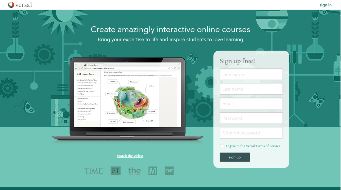
This collection of perfect landing pages highlights the importance of the form, which is without a doubt one of the best tools on hand for capturing clients. However, they should only be used in accordance with the company’s values and also to help encourage the completion of the required fields.
It is important that when designing the form, it doesn´t look out of place with the environment it is in. If your form is well positioned on the page it will blend in and look natural to the user, and not something that is just put there looking out of place with the sole purpose of making the client look at it and that’s all. Versal does this well.
7.- Shopify
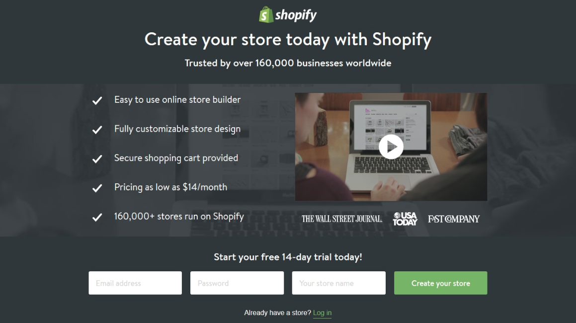
Another example of a perfect landing page that doesn’t require elaborate creatives or spectacular designs is Shopify. Sometimes just with text you have the opportunity of being more direct and persuasive than with an image. However, a video is also added here, which increases value.
On the other hand, there isn’t anything like showing the user that more than 160,000 people are already using your services to give them confidence and convince them to sign up and become a member of the family. As well as, referencing the ease in which the client can use the services and also the benefits that they can get from them.
It, of course, should always be accompanied by a direct and straightforward form as well as having a good choice of basic elements in order to achieve the perfect landing page for conversions.
8.- ClassPass
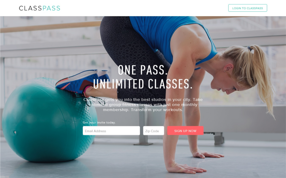
ClassPass sells sporting experiences and from the first glance the landing page manages to encapsulate that essence. It sells sport, where you can learn it, places to practice it and also unique experiences to do with it. In order to do that it makes use of the hero image that is synonymous with competitive sports.
80,3% of the users attention is focused on the top half of the page, and in addition to the powerful visual image used the brand also places a form which the user wont think twice about.
Likewise, the copy also has its own strength. It clearly shows you the ease in using the service: “One pass. Unlimited classes.“ Referencing that you only need one pass to be able to enjoy a whole host of unlimited activities.
And furthermore you could say that this also goes together with the ease of signing up. It’s perfect for grabbing the attention of the user and persuades them to fill in their details. People don’t like complicated steps so having this kind of call to action is a really good idea. Not just because it encourages action but also by showing a form that is so clear and brief will help to make sure that the process is completed.
In short, it is one of the best examples of a perfect landing page as it combines strong visual content with a form that supports the text.
9.- Redfin
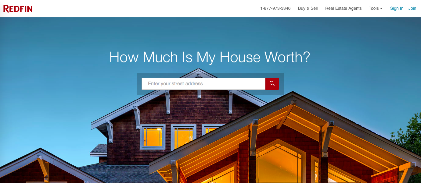
One of the basic requirements of a good form is that it only contains the necessary fields. We are so used to always being asked for our email address but what do you think about this proposal? It is certainly innovative, isn’t it?
In all of the examples that we have seen so far of perfect landing pages this is possibly the one that most clearly directs its communications towards its objective. If you were dealing with an real state agency, what better way is there than by asking for an address on your form? Therefore, depending on where the user lives the app will send them a free valuation of their home.
10.- MDirector
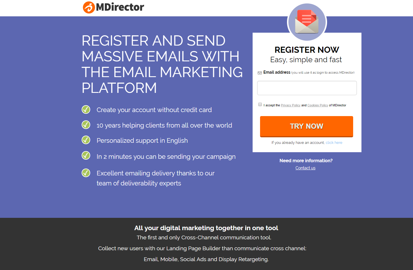
Out of all of the examples of perfect landing pages how could we forget to include some of those created by MDirector. Here is a perfect image that highlights the importance of the form. Who says that it has to have dozens of fields to be effective?
Regardless of whether it is your emails or your forms, users will always be more receptive to a brief concise form than to an endless one. Nothing more is needed to make visitors leave your site than to present them with a multitude of fields to fill in.
Put yourself in their position and think about how you react when faced with a seemingly never-ending form. Therefore, you should only ask for what is right and necessary and in the future if you require more information you can ask for it gradually, little by little, so that the user doesn’t become overwhelmed and be put off by all of the questions.
At MDirector we are specialists in the creation of landing pages and this example goes to prove it. Everything has been chosen for a reason. From the choice of colours to the big clear call to action button. The key to a great landing page is not to show how beautiful your product is but to convey how it will solve their problems and, above all, how easy it is. A landing page should always be clear, easy and direct.
In short, you can see that a definitive guide for creating the perfect landing page doesn’t exist but you must take into account the aspects that have been raised in this article. In addition its is highly recommended that you have at your disposal a software that generates landing pages to help you overcome any technical problems that may arise.
With Landing Optimizer, MDirector’s Landing Page generating software, you can create optimized landing pages for desktop and mobile devices in minutes. Easily launch capture pages without the need for technical knowledge and attract clients through the best pages and the best forms.


 and Its Importance in Email Marketing?")